
Read and React: Titans Unveil New Uniforms
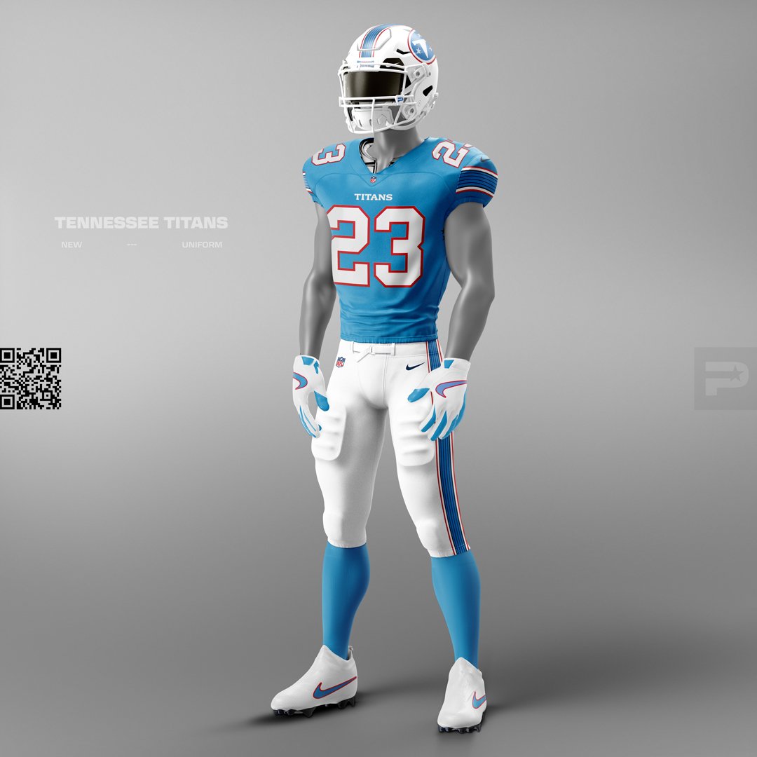
Tennessee Titans new uniforms as mocked up on our Photoshop football uniform template.
The Tennessee TItans unveiled new uniforms on THursday, March 12th, 2026. Just a few hours before the official reveal event, images were leaked on social media and fans immediATELY began reacting. Some fans loved what they saw, while others thought the designs fell flat and lacked originality.
We had some thoughts, too, so we decided to use this latest uniform release as an opportunity to begin our Read and React series, where we’ll react to new uniforms, give them a grade/ranking, and even show you what we would do differently with some tweaks to the official designs.
Before we begin, let’s go over what the grading system looks like, starting with our “Scoreboard” graphic, which will be blank for now (see the completed version for the new Titans uniforms at the end of this post).
Also, if you want to try mocking up your own uniform ideas, you can get started here.
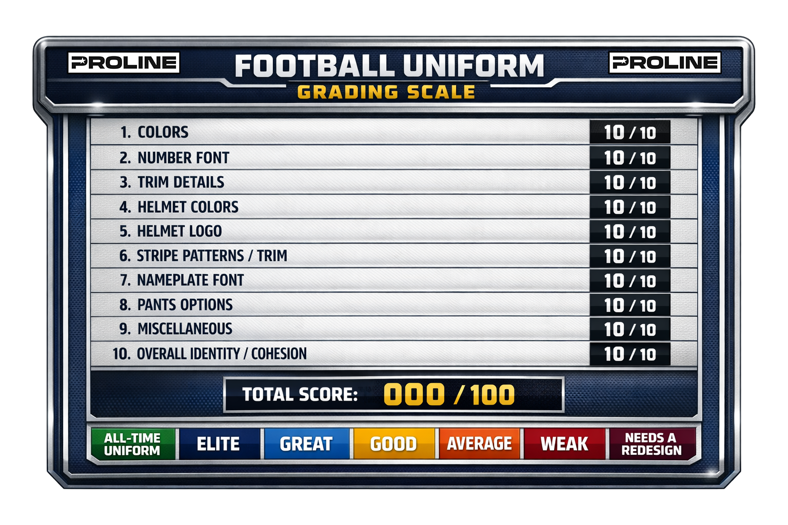
Grading System - How it Works
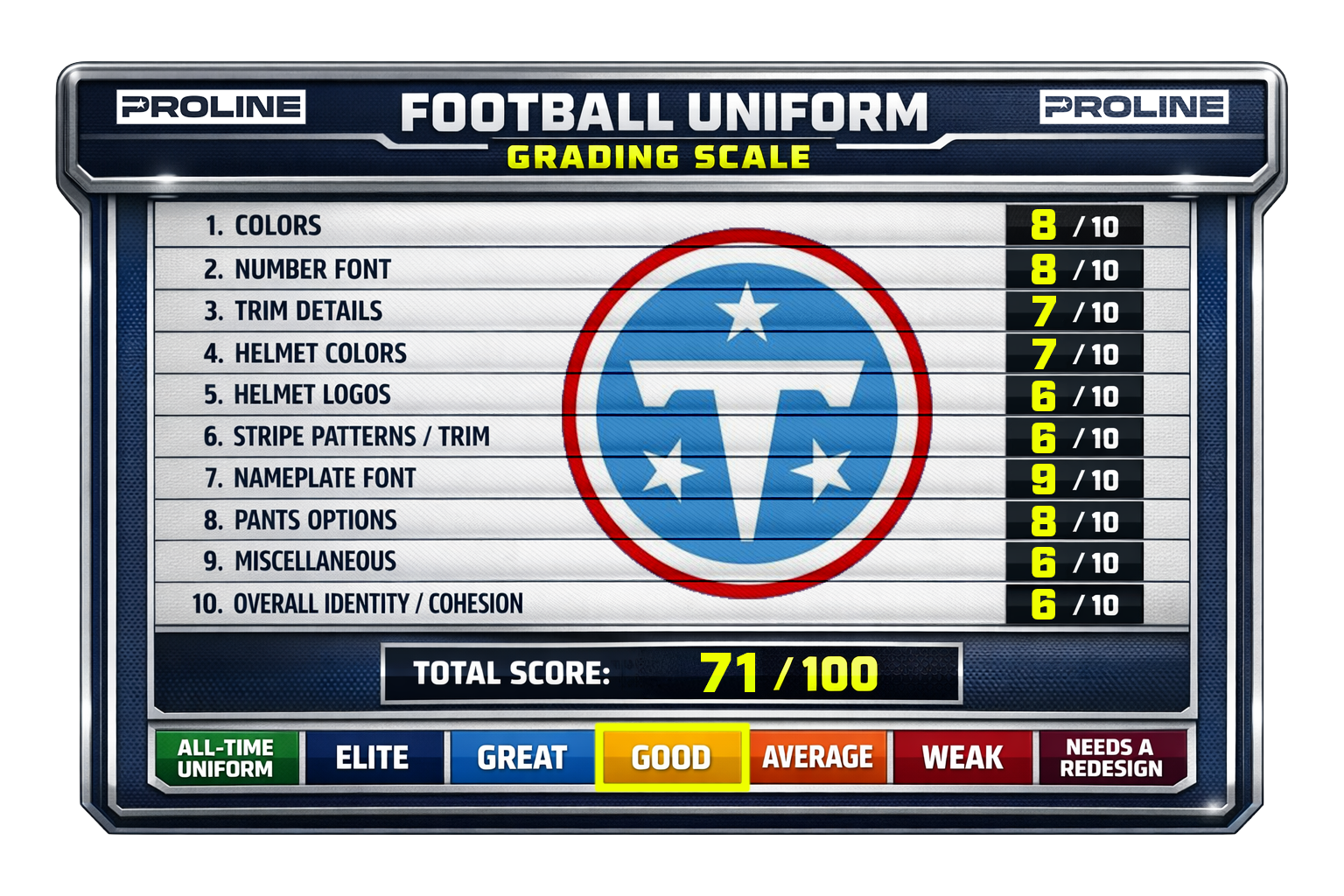
We’ve established ten categories to assess each uniform on. Each category has a 0-10 grading scale. The scores from each category are added together for a total score out of 100.
1. Colors - Palette strength, uniqueness, contrast, and team identity
2. Number Font - Legibility, style, uniqueness, and fit with team branding
3. Trim Details - Outlines, piping, bevels, shadowing, and finishing details
4. Helmet Colors - Shell color effectiveness and match with uniform palette
5. Helmet Logos - Icon quality, scale, recognizability, and placement
6. Stripe Patterns / Trim - Sleeve stripes, helmet stripes, pant stripes consistency
7. Nameplate Font - Legibility and compatibility with number font
8. Pants Options - Variety, stripe design, and uniform combination flexibility
9. Miscellaneous Elements - Patches, collar design, shoulder marks, side panels, etc.
10. Overall Identity / Cohesion - How well everything works together visually
The total score is then used to give an overall rating based on the tiers below:
95–100: All-Time Uniform
90–94: Elite
80–89: Great
70–79: Good
60–69: Average
50–59: Weak
Below 50: Needs a Redesign
Want to make sure you get the latest updates from ProLine? Including posts like this one, breaking news, new products and more? Drop your info below and hit the Submit button.
How did the Titans do?
Let’s get into our official review of the new Titans uniforms, with the overall rating to be revealed at the end after each category has been discussed.
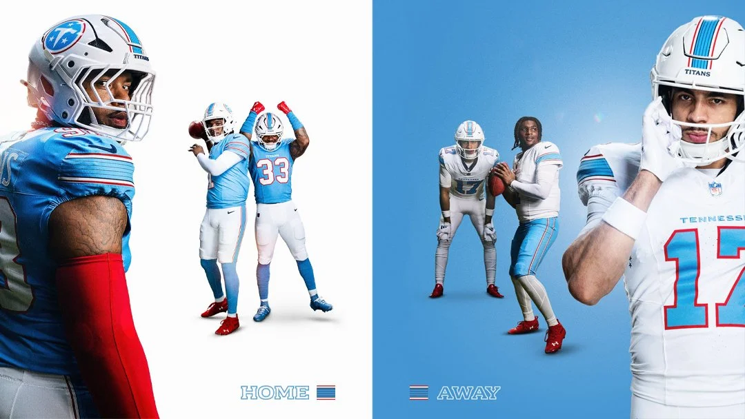
Colors - 8/10
Baby blue, white and red just work and are unique in the NFL, so that’s an easy win. That being said, the Titans felt it necessary to keep Navy blue in their uniform palette, albeit minimally. The result feels a bit forced rather than purposeful, especially when Navy does not appear in the new logo at all.
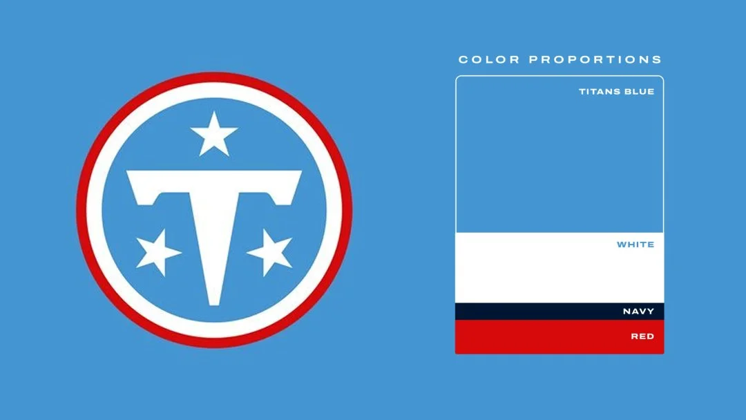
Images property of Tennessee Titans and posted for reference purposes only.
Number Font - 8/10
Using standard block numbers is an easy way to score points here, but not a guaranteed 10. The Titans have reverted back to their Oilers roots with the block numbers with bright red outlines, but now they have basically the same numbers as many other teams, some of which will never change (Cowboys, Raiders, Packers, etc.). A proprietary number font would have been a good way to create an even more unique identity that could become synonymous with Tennessee Titans football. When done well, a custom number set can be great (Vikings) or disastrous when done poorly (Falcons). We understand the move here, but were hoping for something unique.
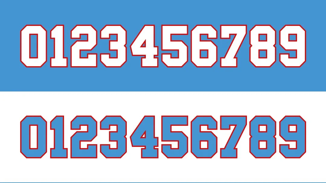
Approximation of Tennessee Titans number set.
Trim Details - 7/10
Red trimmed numbers pop and look great on both the blue and white jerseys. Sleeves having stripes is a win (more on stripe details later). Pants having stripes is also a win. No stripes on socks (that we’ve seen) continues a disturbing trend in the NFL. Team/city name on the jersey chest is overplayed but at least it’s not oversized here (Cardinals, Falcons). No stripes on the jersey collar is fine, but some detail here could have been fun if properly executed and not too busy. Same with the jersey cuffs.
Images property of Tennessee Titans and posted for reference purposes only.
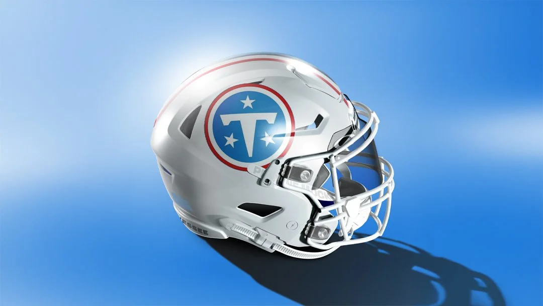
Helmet Colors - 7/10
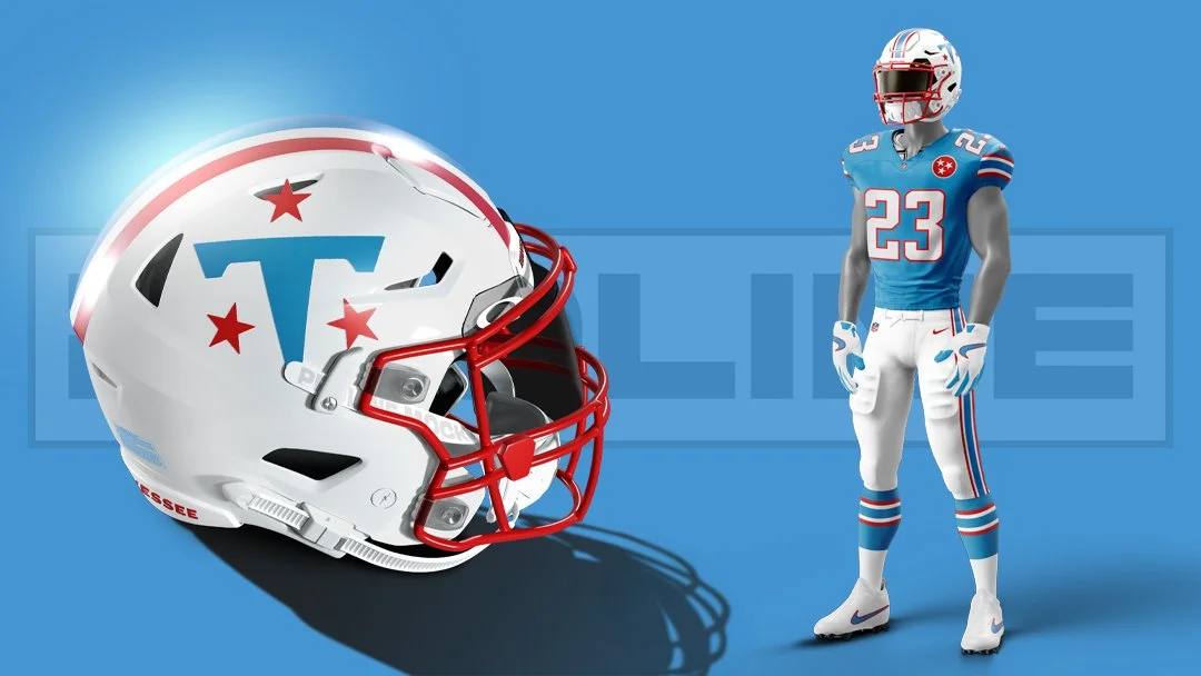
THe white gloss base for the helmet was the right choice. THe matching white facemask is not terrible, but many fans feel that red would have looked better. That’s pretty much objectively true, but the team wanted to do something new here rather than a copy of past Oilers helmets. Overall the helmet looks really sharp while lacking the full pop that a bright red facemask would have achieved.
Tennessee Titans new helmet as mocked up on our Photoshop template.
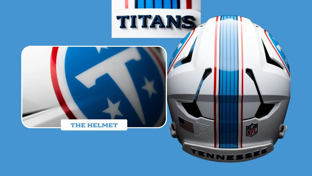
Helmet LOGOs - 6/10
The Titans are one of the few teams that could have pulled off adding something that wraps the helmet rather than just slapping the main logo on the side. They somewhat lost that ability when they ditched the flames, but could have done something more interesting here with the “T” and/or stars. ROundel logos are all the rage in sports branding these days for various reasons, but it feels like the helmet logo could have been more interesting. Perhaps an alternate will mix it up a bit. We discussed the stripe pattern before and we’re glad the helmet stripes are consistent with the rest of the uniform. The front and rear bumper logos are raised text and look super clean. Still odd that the main logo has zero navy…
Images property of Tennessee Titans and Riddell and posted for reference purposes only.
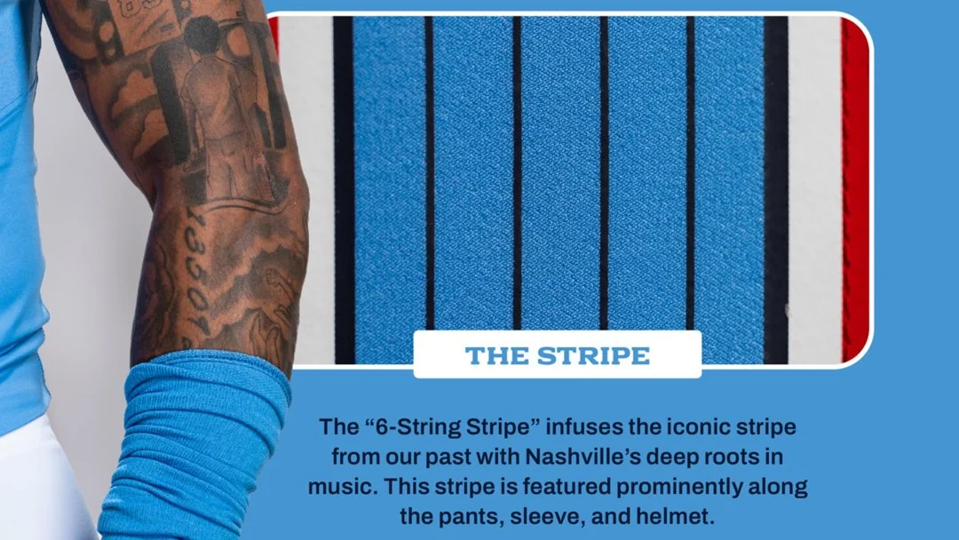
Stripe Patterns - 6/10
Bringing back the main idea from the Oilers stripe patterns was a great call. Forcing Navy blue into them in the way of “guitar strings” misses the mark. The overall proportions of the stripes are also a bit odd, with the inner blue area feeling a bit too wide and the outer colors feeling a bit too narrow. Getting back to the strings idea, if truly going for a “6-String Stripe” shouldn’t all of the strings be the same width for uniformity or descend from large to small like a real guitar does?
Images property of Tennessee Titans and posted for reference purposes only.
Nameplate Font - 9/10
This is really great. It’s clean and legible while being 100% on-the-nose Tennessee (maybe too on-the-nose?). It would have been easy to play it safe here with standard block text to match the numbers, but instead they chose to match the new branding and it was the right call. Adds just enough character to be interesting without being distracting.
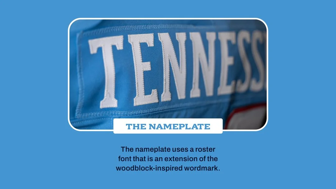
Images property of Tennessee Titans and posted for reference purposes only.
Pants Options - 8/10
The uniform reveal showed us two pants options, white and blue. It also showed us three uniform combinations: blue jersey/white pants, white/blue and white/white. This is really all they need and we hope they don’t do a full blue combo (or at least break it up with white socks if they do). We were hoping for the blue pants to be shiny, but the matte look works well here.
Images property of Tennessee Titans and posted for reference purposes only.
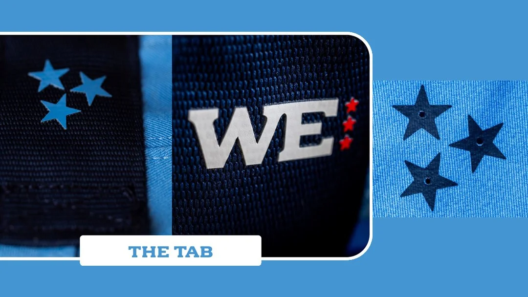
Miscellaneous Elements - 6/10
Tennessee fans are certain to be thrilled with having the state flag’s tri-star properly oriented on the team’s uniforms. Too bad some of them are tucked under the armpit where they’ll rarely be seen. The back collar tab does add a nice touch of modern without being too gaudy, though.
Images property of Tennessee Titans and posted for reference purposes only.
Overall Identity/Cohesion - 6/10
The colors are mostly great, the stripes are consistent (which for some reason is hard to do for other teams), the fonts pair well together (still would have loved a custom number font). But… this is the Oilers, not the Titans. Nothing about this says “Titans” and the “Tennessee” vibes feel forced with only the tri-star, guitar strings and very “University of Tennessee” lettering. It may have made more sense to go full rebrand and just switch back to the Oilers completely. After all, that’s what people will think whenever they see these uniforms.
Total Score - 71/100 - Good
THese barely squeezed in to the low end of our “GOOD” range (70-79), which may feel a bit harsh, but we feel the rationales above make sense. With some tweaks these could be elite.
Speaking of tweaks…
here’s what we would change to make these elite uniforms.
ditch the navy and don’t look back
It’s barely there anyway. We understand they want to keep some of that Titans color palette, but this whole look would be better served by elimiNATING it entirely or leaning into it even more. We chose the former.
While we’re at it, let’s go with a red facemask and bumper logos, and a more interesting take on a helmet logo that removes the circular borders of a roundel and plays more with the colors.
Thicken up the red and white portions of the stripes. Again, if you’re going for the Oilers look, just go with it.
Add a block-ish number font that has some slightly rounded corners to pair with the front bumper wordmark.
Remove the team name from the front of the jersey. It’s not needed when the uniform is clearly indicative of the team.
Add a tri-star chest patch because chest patches are cool and it breaks up the monotony of the blue just a bit since the collar is staying solid blue.
Add sock striping - this is a must for this team and the NFL in general.
What do you think?
What rating do you give the new Titans uniforms? What did you want to see that didn’t end up in the final product? Let us know your thoughts in the comments and stay tuned for upcoming editions of Read and React when we take a look at new uniforms from the Falcons, Commanders, Ravens and Rams.
FOLLOW US ON SOCIALS // @PROLINEMOCKUPS